Cornhole Board Patterns That Read From 27ft
Dana Whitfield, Contributor
12 min read
You picked a chevron or team-logo layout from a photo gallery, painted it on a regulation face, and now you cannot find the hole from the pitcher's box. That is the gap most inspiration posts skip: adult play puts your eyes 27ft from the opposite board, and cornhole board patterns that look sharp on a phone screen often turn into gray mush at that distance.
The short answer: Patterns that read from the foul line use high contrast, wide geometry measured in inches (not hairline pinstripes), and a clear hole hierarchy. Keep busy art out of the zone around the 6in cup, which sits 9in from the top edge on a 24in x 48in face. Matte or satin finishes beat high gloss in afternoon sun. If you cannot spot the hole after a ten-second squint test from 27ft, simplify before you commit to paint, wrap, or print.
| Fact | Detail |
|---|---|
| Adult board distance | 27ft front edge to front edge (ACL ±1/2in; ACA; ACO 2024) |
| Face | 24in x 48in playing surface |
| Hole | 6in diameter, 9in from top (rear) edge |
| Readability rule | If you cannot read it at 27ft in daylight, simplify |
| Sheen | Matte or satin preferred over high gloss outdoors |
For full court spacing and face measurements, see regulation cornhole board dimensions and cornhole board size and distance explained.
Why cornhole board patterns look different from 27ft
The foul line is the front edge of the board. You stand behind it and stare at the opposite face from roughly 27ft away. According to ACL, ACA, and ACO rules, adult boards sit 27ft apart front edge to front edge (ACL and ACO allow ±1/2in).
At that distance, fine detail collapses. Let's Print Big notes that cornhole graphics viewed outdoors in full sun can fall flat unless contrast is strong enough to stay visible from about twenty feet. Theater of Sports, in its custom paint guide, cites the same ~27ft viewing distance and recommends high-contrast, simple patterns for tournament visibility. A layout that reads as "detailed" on your workbench can disappear once bags start sliding across the surface.
Pattern types ranked for throw-line readability
Not every cool cornhole board design survives regulation distance. Rank options by how clearly the hole stays visible from the pitcher's box.
| Pattern type | 27ft readability | Hole distraction risk | DIY difficulty | Best finish path |
|---|---|---|---|---|
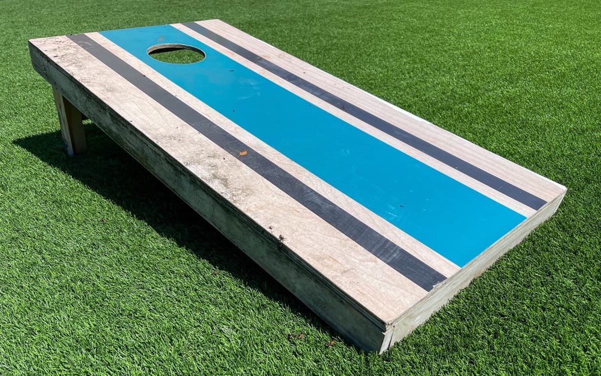
| Border stripe (dark rail, lighter field) | Excellent | Low | Easy (tape) | Hand paint or direct print |
| Chevron / zigzag | Good if legs stay wide | Medium (avoid crossing cup center) | Moderate | Paint with stencil layout or wrap |
| Wide horizontal bands (2–3 max) | Very good | Low | Easy | Paint or stain |
| Wood-grain faux (stain or wrap) | Good via tone shift, not thin lines | Low | Moderate | Stain designs or vinyl wrap |
| Center logo badge below hole zone | Good with halo/ring around cup | Medium | Moderate | Paint, wrap, or vector graphics |
| Full-bleed photo or busy camo | Poor unless hole ring is bold | High | Hard to fix | Wrap or direct print with strong ring |
Border stripes and wide team-color rails are the safest striped cornhole boards for backyard cookouts. Chevron cornhole boards work when each leg is wide enough to read as a shape, not a texture, and the point never crosses the hole center.
Color contrast and team palettes that survive afternoon sun
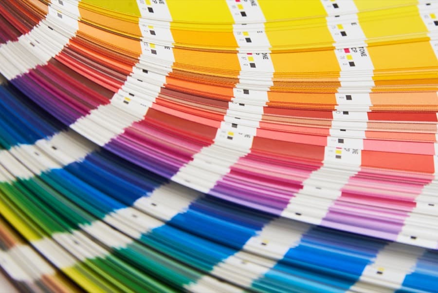
Two or three colors beat a rainbow field. Complementary pairs (navy and cream, black and yellow, forest green and white) hold up when Let's Print Big's full-sun scenario kicks in. Pastel-on-pastel and red-on-orange look fine in the garage and vanish on the lawn.
Remember that bags on the board add moving visual noise. A pattern busy enough to compete with sliding duck cloth makes the cup harder to track. For hand-painted paths, our guide to painted cornhole board designs that hold up outdoors covers sealer stacks once you lock a high-contrast palette.
Hole zone and safe layout on a 24in x 48in face
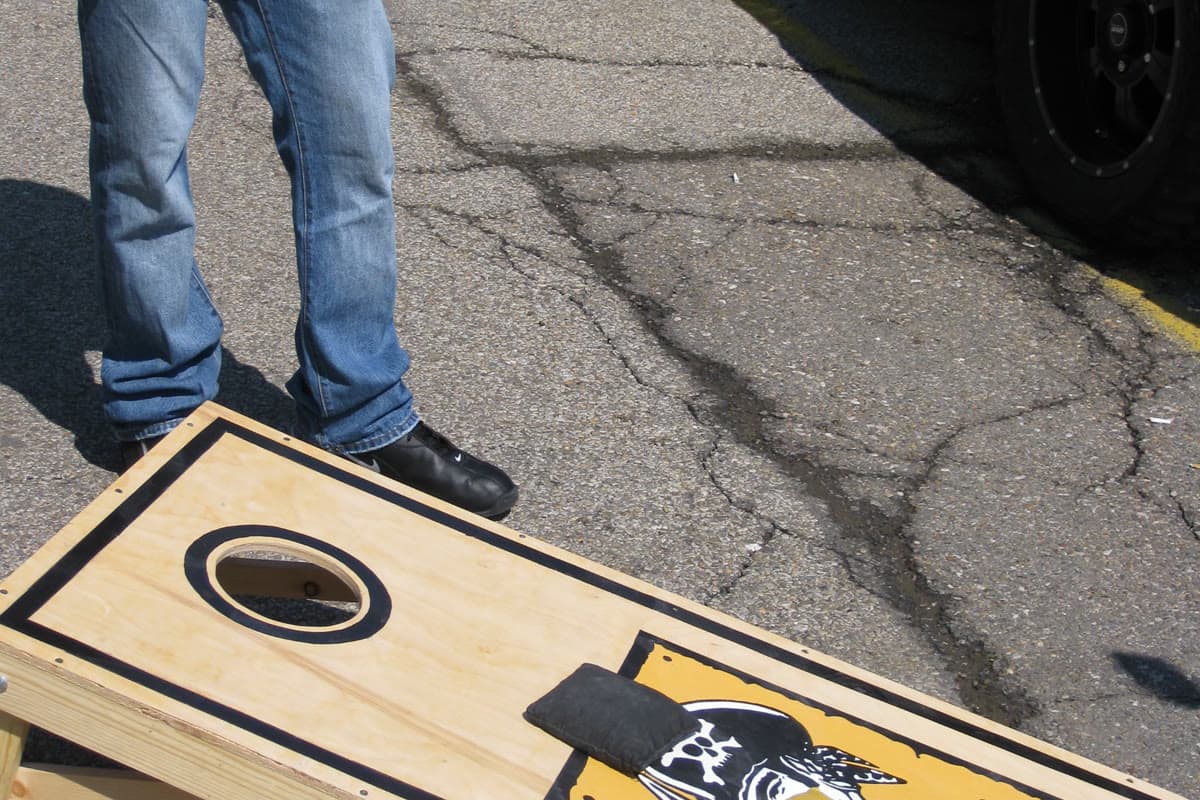
The top third of the face holds the 6in hole and whatever ring or negative space you want around it. Keep chevrons, logos, and geometric shapes out of the busy zone centered on the cup. A dark or light ring around the hole gives the eye an anchor that survives throw-line distance.
Let's Print Big's graphics guidance emphasizes safe zones and contrast for full-coverage designs. If you are taping chevrons or monogram borders, the stencil and layout post covers hole-safe masking on a regulation face. Vector builds should follow the same clearance rules in the graphics and file-spec guide.
Matte, satin, and gloss: how finish changes pattern perception
Finish changes how stripes read as much as color does. Jayi Games notes that glossy clear coats can create glare that hurts gameplay visibility, while semi-gloss is a common outdoor default. Theater of Sports recommends high-contrast patterns with finishes that do not flash back at the thrower.
Matte kills glare and slows slide slightly. Satin sits in the middle and is what most tournament players expect. High gloss can make adjacent stripe colors look identical when the sun hits the face dead-on. If you already picked bold geometry, do not undo it with a mirror-like top coat.
Paint, stain, wrap, or direct print for bold geometry
| Path | Pattern strength | Fleet consistency |
|---|---|---|
| Hand paint + tape | Great for wide stripes and borders | Drifts board to board |
| Two-tone stain | Grain-forward borders and fields | Same drift on multiples |
| Vinyl wrap | Sharp geometric SKUs at 24in x 48in | Peel and fade risk; see wraps vs paint |
| UV-cured direct print | Holds fine logos at scale on birch or all-weather faces | Best match for six or more identical boards |
Hand paint is perfect for one tailgate set. A taproom fleet that needs matching stripe weight on every board drifts when each face is taped by hand. UV-cured direct print (artwork cured into the surface, not a vinyl skin) is the path when identical geometry matters across a league row. YourBoardWrap's wrap-design posts highlight how geometric skins can make boards stand out, but durability tradeoffs belong in the wraps vs paint comparison.
Commercial pattern stencils (Designer Stencils lists large-format options such as Ikat and chevron-style fills at $69.99) prove demand goes beyond Pinterest boards, but stencils still need the same contrast and hole-clearance rules at full scale.
Test your pattern at throw-line distance
Do not pick a finish path until the layout passes a distance check.
- Tape or print a full 24in x 48in mock at true scale (when it launches, the coming designer preview will show a regulation face on birch or an all-weather surface with zoom and shareable links).
- Set the board on regulation legs at playing height.
- Measure 27ft from the front edge and mark the pitcher's position.
- Stand in the box and squint at the opposite face for ten seconds. Can you find the hole without hunting?
- Repeat at noon and late afternoon if you can. Glare changes stripe visibility.
- If bands or chevron legs vanish, widen them or add a contrasting border rail.
- Only then choose paint, stain, wrap, or print.
The designer page will host that preview tool when it goes live. Until then, a taped mock at full scale beats guessing from a thumbnail.
Pattern ideas for tailgates, weddings, and taproom fleets
Tailgate: Team-color border stripe plus a simple mark in the lower field. Skip script type and micro logos. Browse 25 design ideas for style prompts once readability rules are set.
Wedding: Monogram border in two tones, kept out of the hole zone so it reads in ceremony photos as well as at the throw line. See wedding occasion ideas for tone and layout notes.
Brewery or league: Identical stripe weight and logo scale across six or more boards. Hand paint drifts; direct print or a shared vector file keeps fleet geometry consistent. Business and league buyers ordering multiple matching sets face this batch-drift problem most often.
Common cornhole board pattern mistakes
| Mistake | Result (or why it hurts) | Fix |
|---|---|---|
| Hairline pinstripes or thin chevron legs | Stripes merge into a gray field at 27ft | Measure borders in inches; widen every leg |
| Pastel-on-pastel or low-contrast team pairs | Pattern disappears in full sun | Limit palette to 2–3 high-contrast colors |
| Busy art across the hole center | Cup becomes camouflage | Move geometry to lower field; add a hole ring |
| Gloss-only clear coat | Glare washes out stripe edges | Choose matte or satin/semi-gloss outdoors |
| Micro type or script logos | Illegible from the pitcher's box | Use bold sans-serif block letters or drop text |
| Board color matched to lawn | Front edge and hole rim vanish | Add a contrasting border rail |
| Stencil bleed into hole rim | Uneven cup edge reads as a bump | Mask hole zone before spraying pattern fill |
What to do after reading this
Start with a throw-line squint test on a full-scale mock before you buy paint or order a wrap. Cornhole board patterns that pass at 27ft are ready for finish choices. If you want style prompts next, read 25 cornhole board design ideas. For tape geometry on chevrons and borders, use the stencil and layout guide. When you need identical bold geometry across a fleet, read about materials and UV-cured direct print and what the coming designer preview will show on a regulation face.